By , communications executive, IAB
Last Wednesday saw the IAB’s biggest mobile event to date – IAB Mobile Engage – which promised a whole day of mobile marketing ‘without the hype’. Some 350 delegates filled the newly refurbished conference room at the Millbank Media and Cinema Centre, a majority of whom were UK brands, eager to escape the waffle surrounding the industry and just get simple, straightforward advice on how to do it.
The bulk of the programme was, as you’d probably expect, about mobile, but one presentation in particular really stood out for me, on Creativity in Mobile, presented by Mark Freeman, creative partner at Movement. During his presentation, Mark said something that really resonated with me, and made me realise how ’social’ creativity is in general nowadays, that ‘little actions lead to big results’.
Mark began his session by using an interesting analogy about two states of consumer engagement; the ‘heads up’ v ‘heads down’ state. The ‘heads down’ state is where the consumer is heavily engaged with their mobile device either through reading/sending a text message or browsing the internet. Previously this has been the time when brands have aimed to hit their target audience with their campaign message. However, Mark pointed out that actually a small call to action involving people’s mobile handsets on outdoor advertising mediums can be just as – if not more – effective (this is when they are in the heads-up state).
The simplicity factor was highlighted throughout his presentation. You don’t need to spend thousands on an app that is difficult to use or frequently fails to load. Instead, keep to something that your consumer needs and wants to have on their phone, tapping into the ‘desire’ factor. It is important not to forget how impressed people are by small personal touches when executing a successful creative mobile campaign, impressing your customer will make them want more, leaving them with that warm fuzzy feeling about your brand. And social is no different – it’s the personal touch that counts.
It became clear from Mark’s presentation that the sociable aspect sits deep within the heart of mobile creativity. He referenced a number of well executed creative mobile campaigns; the ‘Nike interactive chalkbot’ that was executed on the roads of The Tour de France was one of the examples. Users were invited to submit messages of support and inspiration via SMS for the chance to be printed on the Tour roads for all to see. The campaign was created by Wieden + Kennedy, Portland, Nike and Lance Armstrong’s foundation for people affected by cancer.
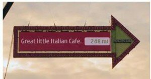
Another great campaign that was mentioned was ‘The World’s biggest sign post by Nokia’. The objective of this campaign was to drive interest around their navigation products and to inspire people to use them on their mobile phones. Nokia wanted to turn navigation into something social through an extremely simple idea - a large sign post erected in the centre of London (over 50m tall). The sign pointed out the direction of people’s favourite locations all over the world. People sent an SMS direct to the sign post asking what direction a certain location was and within moments the arrow would turn, displaying the location for all to see. To see this campaign in full click here.
Both of these campaigns are about simple effortless interaction however the results are BIG (in one case quite literally). What’s more they both hammer home the fact that mobile and social are inextricably linked and complement each other incredibly.
For me, this presentation told us a lot about how digital creativity will look in the future… Offline and online worlds will merge, we’re likely to see campaigns of a much more experiential nature, and brands will understand that you want to really engage consumers in a digital age, then those personal touches will go a long way.


